Steni adorns tourist road project
The Atlantic Ocean Road is perhaps the biggest attraction for motorists here in Norway. At Eldhusøya, the architects at Ghilardi + Hellsten have created a picnic area that is a destination in itself.
In a landscape dominated by the sea, the Atlantic Ocean Road winds its way between islands, islets and rocks in the sea. At the very end of the sea gap between Molde and Kristiansund, motorists have good reason to take a break at Eldhusøya, where they can enjoy a dry walk along 700-metre-long stainless steel path that wends through the landscape – and take in the beautiful ocean view.
Reflects the landscape
“The project at Eldhusøya is part of the Norwegian National Road Administration’s national tourist road project, a project that aims to highlight significant destinations that showcase the Norwegian landscape,” says Erik Stenman, architect and partner at Ghilardi + Hellsten Architects.
And it is precisely the landscape in the broad sense that was a guiding idea in the concept.
“We were focused on ensuring that the design of the project at Eldhusøya was based on a relationship with the place where the landscape, road and bridge together establish our starting point.
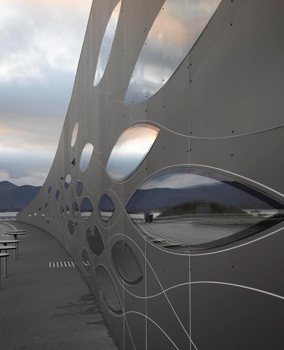
We wanted the façade to have a contextual motif that could, if you like, be interpreted as a herring shoal.Architect Erik Stenman, Ghilardi + Hellsten Architects
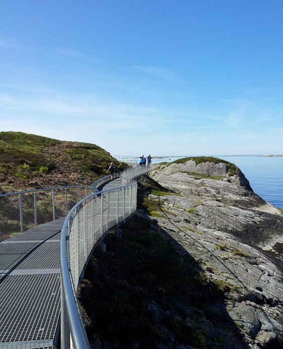
You can enjoy a dry walk along 700-metre-long stainless steel path that wends through the landscape.
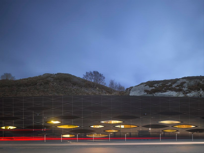
Evening mood along the Atlantic Ocean Road.
Harsh climate
The 700-metre-long steel path around the island leads you through a 180-metre-long façade. Behind the façade, which is also a retaining wall, there is a 150 square metre service station with a small café, information centre and public restrooms.
“We wanted the façade to have a contextual motif that, if you like, be interpreted as a herring shoal,” says Stenman. When choosing materials, it was important to ensure that they would be resistant to wind and weather. “It can be pretty intense out there in the ocean gap when the weather hits,” he says.
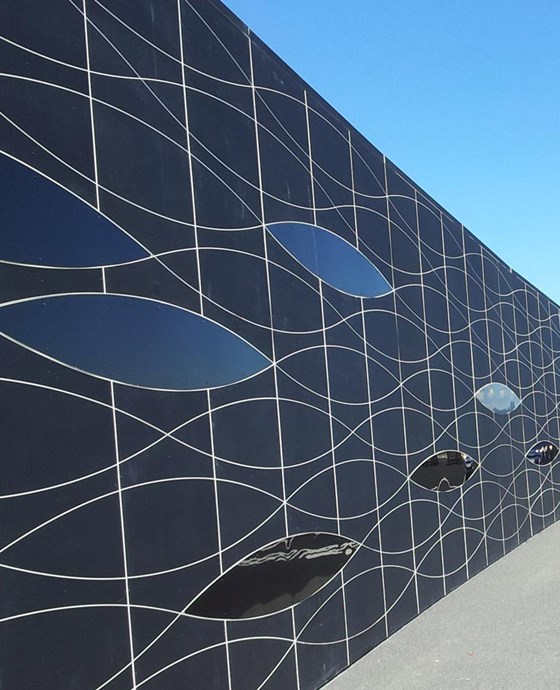
En sildestim?
No two are alike
Steni’s façade panels have the qualities needed to meet climatic challenges.
“At the three-year inspection, all the panels were still as good as new,” says Stenman.
At the same time, STENI was able to provide a solution that gave the façade the aesthetic design the architects were looking for. They could offer individual milling of the pattern.
“No two of the panels are alike, so it became a bit of a jigsaw puzzle,” says Stenman.
From his point of view, this is one of the qualities that make the façade panels exciting to work with.
“The ability to mill all the plates differently affects the expression,” he says, explaining that Ghilardi + Hellsten Architects chose to use Steni Colour.
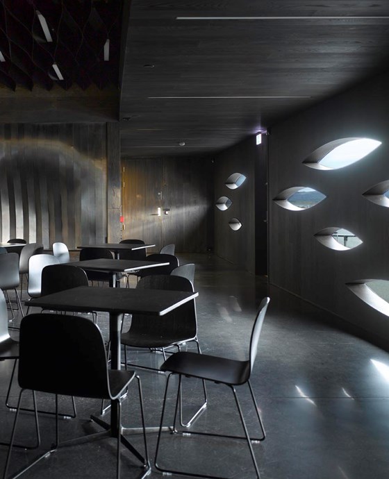
The interesting pattern is also visible from the inside.


